I remember the first time I learned that the famous “Blue Marble” photograph of Earth wasn’t actually a photograph in the traditional sense. Not the 1972 one — that was a real photo taken by the Apollo 17 crew. I mean the 2002 version, the one that became the default desktop background for millions of computers. That one is a composite. Multiple satellite passes, stitched together, color-corrected, and processed into what we think of as a single image.
My first reaction was to feel a little deceived. Then I started asking why, and that’s where it got interesting.
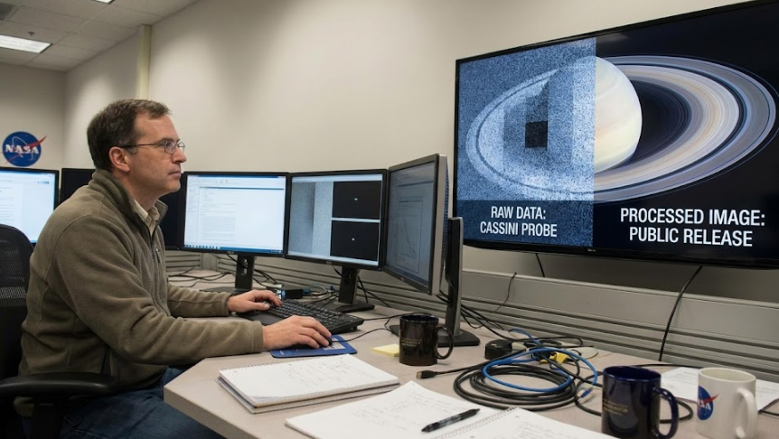
Space imaging isn’t like vacation photography. You’re not pointing a camera at something, clicking, and getting a picture. The distances are enormous. The targets are moving. The instruments aren’t cameras in the consumer sense — they’re often sensors that detect wavelengths of light humans can’t see. And the data they collect comes down as raw numerical information that has to be translated into something visually coherent.
Every space image you’ve ever seen has gone through processing. Every single one. The question is how much, and what kind, and whether the decisions made in that process are clarified to the people viewing the result.
Let’s start with color. Most space imaging sensors don’t capture images in full color the way a digital camera does. They capture individual wavelengths — red, green, blue, sometimes infrared, ultraviolet, or other bands depending on what they’re designed to study. These separate exposures are taken at different times, often seconds or minutes apart, and then combined into what’s called a “false color” or “representative color” image.
The Hubble Space Telescope, for instance, takes grayscale images through different filters. A team of image processors then assigns colors to each filter and combines them. The resulting image shows real structure and real features, but the colors are chosen. Sometimes they’re chosen to match what the human eye would see. Sometimes they’re chosen to highlight particular kinds of gas or temperature. Sometimes they’re chosen because they look better.
NASA is fairly transparent about this when asked directly. They publish technical notes on their image processing. But the images themselves? They’re released with captions like “The stunning nebula captured by Hubble” — which isn’t untrue, but it skips over the entire decision-making process that turned the raw data into that particular visual representation.
Earth imaging is even more layered. Satellites in low Earth orbit can’t capture an entire hemisphere in one shot. The field of view isn’t wide enough. So what you get are strips of imagery from multiple passes, taken over hours or even days, then stitched together into a seamless whole.
Clouds are a problem, naturally. If there are clouds over a region during one pass, that data is unusable for a clear Earth image. So image processors use cloud-free data from previous passes, sometimes from completely different days or weeks. The land stays the same (mostly), so they composite it together. Mountains from Tuesday, coastline from Wednesday, desert from last month. It all gets blended.
And then there’s color correction. Earth looks different depending on the angle of sunlight, the atmospheric conditions, and the sensor’s calibration at the time. To make a consistent, visually pleasing image, processors normalize the colors. They adjust the white balance, boost contrast, sharpen edges. The same things you’d do to a photo in Lightroom, but applied to planetary-scale data.
Robert Simmon, the NASA scientist who created the 2002 Blue Marble, has spoken openly about the artistic decisions involved. The ocean color was adjusted to be a deeper blue because it “looked more like the ocean.” Cloud shadows were softened. The final result is gorgeous. It’s also a constructed image assembled from satellite data, not a raw photograph.
Here’s where my curiosity really kicks in: why isn’t this explained more prominently?
I don’t think it’s malicious. I think it’s institutional. Space agencies are communicating with the public, not just scientists. A raw data dump from a satellite instrument looks like noise. It’s incomprehensible to anyone who doesn’t know what they’re looking at. Processing is necessary to make the data understandable. And once you’re processing anyway, why not make it visually compelling?
The problem is that “visually compelling” and “factually representative” aren’t always the same thing. And when the distinction isn’t made clear, people form assumptions. They assume the image is direct, unaltered, the way a handheld camera would capture it. That assumption breaks down under scrutiny.
I’ve seen technical documents from ESA and NASA that go into extraordinary detail about the processing pipelines. Radiometric calibration, geometric correction, atmospheric compensation, mosaicking, color grading. It’s all documented. But you have to go looking for it. The images themselves are presented as if they’re straightforward visual records.
What does this mean for someone trying to understand what’s actually out there?
Mostly, it means you can’t take any space image at face value. You have to ask: What instrument captured this? Over what time period? What wavelengths were used? What processing was applied? Were any sections composited from different passes? What decisions were made about color, contrast, and brightness?
None of this is a secret. It’s just not advertised. And that gap — between what’s technically documented and what’s publicly communicated — is where assumptions thrive.
I’m not arguing that space images are fake. They’re not. The data is real, the features are real, the structures are real. But the visual representation you see is a curated interpretation of that data, shaped by technical requirements and aesthetic choices in ways that are rarely discussed outside specialist circles.
That’s worth knowing. Especially if you’re using those images as evidence for how things actually look.