If you have ever looked at a live flight tracking map, you may have noticed something puzzling: airplanes rarely fly in straight lines between cities. Routes often curve, bend, or take paths that seem longer than necessary. This raises many questions for travelers and aviation enthusiasts alike.
Below are clear answers to the most common questions about why air traffic routes look the way they do.
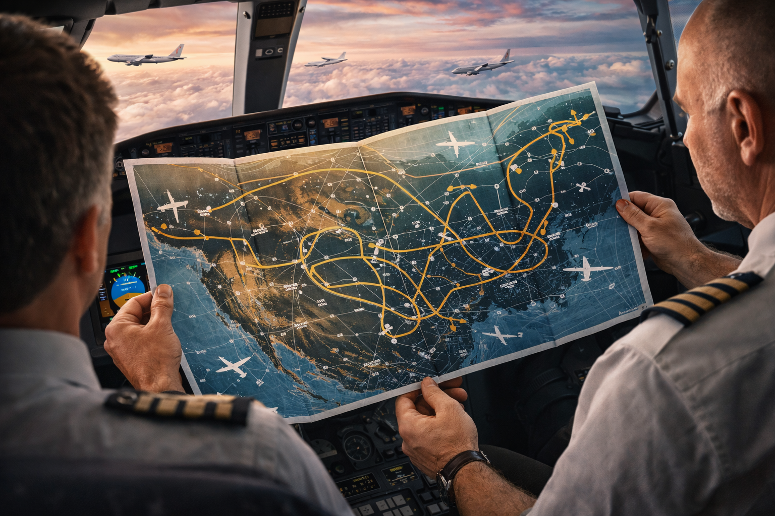
Why don’t airplanes fly straight between two cities?
Airplanes do not always fly the shortest visible path on flat maps because flight planning is based on efficiency, safety, and airspace rules rather than simple visual distance. What looks like a curve on a map may actually be the most efficient route in three-dimensional space.
Why do flight paths curve on world maps?
Most online maps use flat projections of a spherical surface. When long-distance routes are plotted on these maps, straight paths on a globe appear curved on a flat display.
This effect becomes more noticeable on long-haul flights and routes closer to the poles.
Why do planes follow similar corridors instead of unique paths?
Air traffic is organized into established airways, similar to highways in the sky. These corridors:
-
Reduce collision risk
-
Improve communication with air traffic control
-
Allow predictable spacing between aircraft
Following known routes improves overall safety and efficiency.
Do winds affect flight routes?
Yes. High-altitude winds, especially jet streams, significantly influence flight planning. Pilots and dispatchers choose routes that:
-
Take advantage of tailwinds
-
Avoid strong headwinds
-
Reduce fuel consumption
This is why eastbound and westbound routes between the same cities often differ.
Why do some flights avoid certain regions?
Aircraft may avoid regions due to:
-
Restricted airspace
-
Military zones
-
Political conflicts
-
Severe weather patterns
-
Limited emergency landing options
Safety and international regulations always take priority over direct routing.
Why do polar routes look especially unusual?
Near the poles, map distortion becomes more pronounced. Routes that appear highly curved on screens may actually be efficient great-circle paths when viewed on a globe.
Additionally, polar routes require special considerations for communication coverage and emergency planning.
Does this mean flight maps are misleading?
Flight maps are not misleading, but they are simplified visual tools. They prioritize clarity over perfect geographic representation, which can make routes appear unusual without additional context.
Conclusion
Air traffic routes look strange on flight maps due to map projection effects, wind optimization, safety regulations, and established air corridors. What appears inefficient at first glance is usually the result of careful planning designed to maximize safety, fuel efficiency, and reliability.
Understanding these factors helps explain why modern aviation routes rarely resemble straight lines on a screen.