More Than Meets the Eye: The Power of Projection
For centuries, we have trusted maps to be objective guides. However, every map is a selection—a decision to show some things and omit others. This bias begins with the very projection of the sphere onto a flat surface.
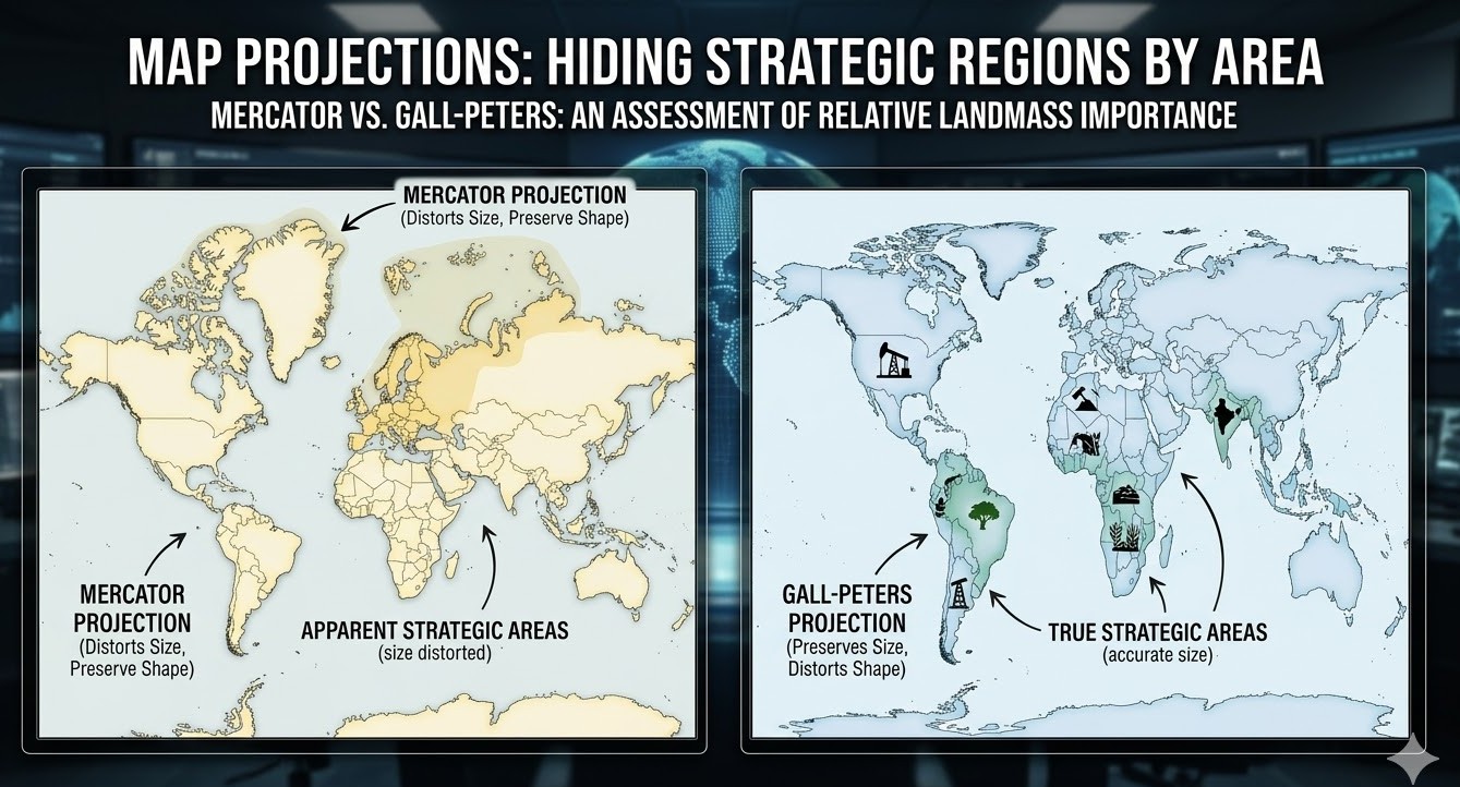
The most common world map, the Mercator projection, was designed for navigation, not fairness. It preserves shape but dramatically distorts size, particularly near the poles. As a result, the Global North (Europe and North America) appears vastly larger than its actual landmass relative to Africa and South America. This cartographic inflation has created a distorted sense of geographic importance, creating a psychological “strategic region” that prioritizes the North.
The Geography of Silence: What Maps Don’t Show
While projections create unintentional distortion, there is also the phenomenon of “cartographic silence”—the deliberate exclusion of features from official maps for national security or political advantage. These hidden locations are often some of the world’s most strategic regions.
1. Disputed and Undefined Borders
The map of the world is not a static legal document. Hundreds of borders remain undefined or actively disputed, from the frozen frontiers of Antarctica (governed by the complex Antarctic Treaty) to the shifting, militarized Line of Actual Control in Kashmir. By omitting these disputes and drawing clean, solid lines, official maps minimize the significance of these geopolitical flashpoints, presenting a world simpler—and less accurate—than it truly is.
2. Hidden Infrastructure
Satellite and maritime maps are frequently laundered of sensitive infrastructure. From secret submarine communication cables to remote military airstrips and strategic missile silos, critical physical nodes of global power are often omitted from commercially available maps. These silent “strategic regions” are often only visible through specialized, non-public cartography.
3. Defining “Zones of Interest”
Power allows nations to project their “zones of interest” onto the map. Consider the Cold War-era “Iron Curtain” or China’s modern “Nine-Dash Line” in the South China Sea. These lines are not physical but conceptual strategic boundaries imposed on the existing geography, transforming ocean and territory into critical national security domains.
Technology and the Digital Era: A New Frontier for Disinformation
The digital mapping revolution has exacerbated, rather than solved, these issues. Digital platforms can instantly obscure locations. Countries like Russia have implemented GPS spoofing to make critical locations appear to be hundreds of miles away, adding a layer of physical and cartographic deception.
Furthermore, digital map providers must often comply with national laws. What borders or city names are displayed on a map can change instantly depending on which country the viewer is logging in from, creating a fractured, politically managed reality.
Conclusion: Critiquing the Atlas
The next time you look at a map, consider not only what is shown but what is absent. The cleanest, most definitive map may hide the most complex global realities. The world’s “hidden strategic regions” are not necessarily hidden physically, but they are often masked by the choices, silences, and political motivations of those who draw the lines. Critiquing the atlas is not just an academic exercise; it is an essential tool for navigating the modern geopolitical landscape.